


As an online marketing company based out of Costa Rica, we are always interested when a large corporation makes a large change and this is one of them.
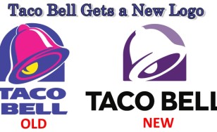
Taco Bell just released their new logo which according to their press release was to refresh their brand and coincides with the opening of their 7,000th restaurant which just opened on the Las Vegas strip, home of casinos and sports betting. This new flagship restaurant is supposed to be their “ultimate expression of the Taco Bell brand, and lifestyle.”
Now that you have seen their new logo, the question that begs to be answered is exactly what that expression and lifestyle is supposed to be. This new logo has simplified the old one which was introduced to the public back in 1995.
We can’t say that we think much of the new logo as their old one was already simple enough but our main issue is the coloring of the words, “Taco Bell” and the new font.
Black just is not an inviting color for a restaurant and it certainly does not portray the delicious spicy food. So the question everyone is asking is why did Lippincott, the creative company behind the new logo choose these colors and that new look?
Are they trying to attract a young Emo and Goth crowd to the restaurant? If anything, the new logo appears to have been made by some Taco Bell’s executive’s son with not even a copy of Photoshop but using that Windows paint program.
I mean seriously, just delete the Taco Bell name, make it black and use a boring font and then just change the logo image with a little brightness and contrast and bam! You got yourself the new Taco Bell logo.
According to Taco Bell, they went with a minimalist approach to appeal to the millennial crowd as according to experts, they are looking for  simplicity, health and hipster design on their food. Hate to break it to them but the logo was already pretty simple, sure they could have just changed the neon purple colors of the 90s but let’s be realistic, does that logo inspire health to you? Does the Yum! Brand really think that Millennial are idiots and won’t be able to see through that new logo?
If they wanted to attract new clients that are simplistic minded, hippies and health conscious they should have just opened a new brand under Taco Bell instead of going on the cheap side and make a new logo.
So how much did someone get paid for that new logo and will someone’s head roll over it?
Recent Comments